
A picture is worth a thousand words.
Projects can generate a lot of data. Large, mature organizations generally have the tools to capture, store, and analyze this information effectively. However, small and less mature organizations and those leading non-traditional efforts often lack the tools, practices, and experience.
I teach project fundamentals classes to non-traditional project managers, such as scientists developing new therapeutics or conducting basic research; or subject matter experts collaborating with others to publish studies and reports. They manage projects but lack the tools.
Adopting even rudimentary visualization practices can provide valuable insights. Project planning and performance management shift from chaotic and happenstance to thoughtful and empowering. The “tools” presented in this article are simple and can be created easily in Microsoft Excel, PowerPoint, Word, or similar software.
Start with the End in Mind
Contents
Project data can be overwhelming. So start with the “end in mind” and begin with the fundamental questions:
- What are the top three questions that we need to answer?
- What do my primary stakeholders (usually management) want to know?
- What does my team need to be more effective?
After defining the problem space, start thinking about the solution space. What data would help answer those questions? Is that data actionable? Can it easily be collected?
Actionability is critical. In other words, what decisions can be made with the information? Many metrics can be collected. But will they help us make impactful decisions? Heatmaps and other standard dashboard metrics are impressive. They provide status but do not necessarily inform decision-making.
Project Roadmap
Roadmaps create transparency and promote accountability. They are flexible and clearly depict project information. They are easy to build and maintain, and do not require complex or specialized tools.
We can use roadmaps to visually depict when key deliverables or milestones are expected to be completed. The timescale can be adjusted to support the project duration and progressive elaboration. For short projects, the timescale can be weeks and scale up to months. The scale for longer projects or programs can be months, quarters, and years.

The Basic Roadmap
A basic roadmap shows the timescale across the top and uses cards to depict significant deliverables or milestones. For co-located or on-site teams, this roadmap can easily be created on a large wall with painter’s tape and sticky notes, which creates focus.
A finance executive for a large consulting firm asked me to help plan an international tax audit. The full-day planning meeting included representatives from the primary stakeholder groups.
We identified the major program deliverables and then mapped out the work for the next 18 months.
More Detailed Roadmap
Details can be added to the roadmap to support more complex projects or programs. Rows or “swim lanes” can be added to identify projects, programs, applications, or organizations contributing to the project. Cards can be color-coded to depict teams, systems, or other components. Lines can be added to show dependencies or interrelationships.

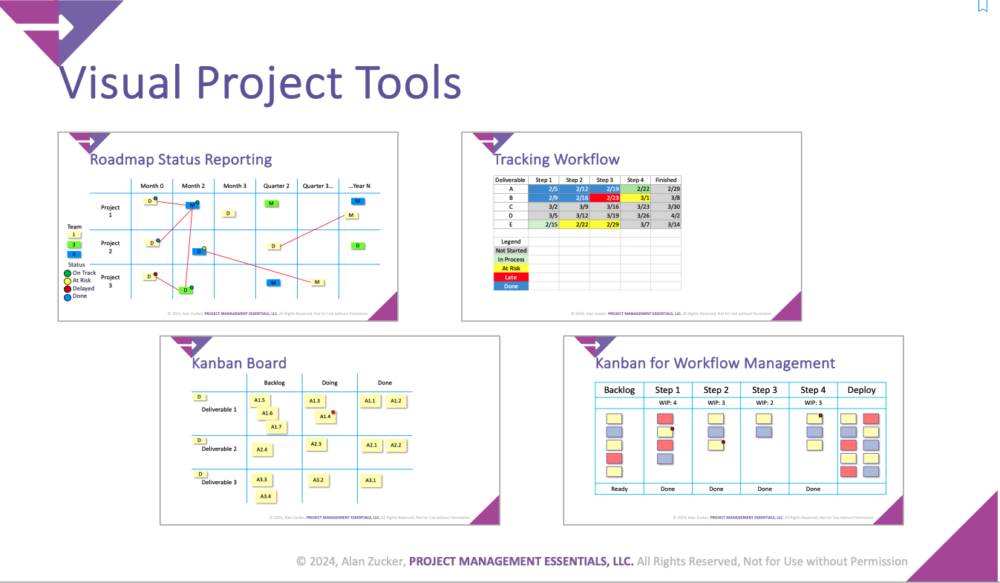
Roadmap Status Reporting
Once created, roadmaps can also be used as reporting tools. We can add colored dots or similar icons to visually depict each item’s status. Common color schemes are:
- Gray – Not started;
- Green – On track, with no significant risks or issues;
- Amber/Yellow – At risk, concerns that the item will not be completed on time;
- Red – Delayed, item is either delayed or likely to be late; and
- Blue – Complete.
A large program was using an enterprise-class project management tool. However, it struggled with too much data, which was difficult to integrate and synthesize into a comprehendible view. The program continued to manage the project execution in the enterprise tool, but it created a high-level management roadmap to communicate the overall status.

They used Microsoft Visio to create the roadmap. Swim lanes depicted the workstreams. Major deliverables were put on the color-coded cards. Lines depicted critical interdependencies. Dots were placed on the cards to show their status. Reports were distributed weekly on ledger (11” x 17”) paper. This simple, yet data-rich view transformed how the leadership team viewed the program.
Kanban Boards
Kanban is a set of principles and practices that creates transparency and enables better workflow management. The method was first developed to manage inventory in its factories. Now, it is widely used by Agile software development teams and increasingly by non-technology teams to manage their work.
The Basic Kanban
The most basic Kanban board has three columns: Backlog, Doing, and Done. The “Backlog” is a prioritized list of the work that needs to be done. “Doing” is what the team is working on now. And “Done” is the completed work.

The “Backlog” items are prioritized by what is most important and provide the greatest value. Items should be small enough to be completed within a week. The “WIP Limit” constrains the number of items being worked on to reduce multitasking. Policies or quality expectations establish what is required to start working on an item (“Ready”) and the quality checks before it is considered “Done.”
Process Management Kanban
We can expand the “Doing” column to define all the steps to complete a process. This framework can be used to manage software development, helpdesk tickets, report writing, or reviewing proposals or job candidates.
Visual cues can enhance the Kanban. Cards can be color-coded to group items by team, project, product, or area. Dots can be applied to cards with problems or issues that must be resolved.

Conducting a daily stand-up or status meeting in front of the Kanban board promotes accountability and the opportunity for collaboration.
Hybrid Workflow Tracking
A hybrid approach to tracking workflow combines Kanban’s transparency with set due dates. Workflow steps can be listed in the columns, deliverables in the rows, and planned due dates in the cells. Cells can be color-coded to depict progress as the work moves through the process.
This approach was inspired by students responsible for managing large Federal reports and Congressional correspondence. They needed a lightweight approach to tracking progress and creating accountability. This simple spreadsheet-based tool can be created quickly, updated easily, and used for operational and leadership reporting.
![]()
Visualization Tools
Several powerful tools are available for collecting, storing, and presenting project data. However, many project managers lack access to these tools, and they require a significant amount of effort to set up and use. Often, simplicity is more effective than sophistication.
The visualization practices presented here are decidedly lightweight:
- Painter’s tape and sticky notes make creating Roadmaps and Kanban boards easy in a team space. The proximity and physicality of the information create a powerful, personal dynamic that is not replicated with electronic tools.
- Mural, Miro, and Microsoft Whiteboard are web-based collaboration tools for distributed teams. They are easy to use, but to have the same impact as physical tools, teams need to integrate the tools into their work practices.
- Microsoft Excel and PowerPoint are the most ubiquitous project management tools and can be used to create this reporting.
© 2024, Alan Zucker; Project Management Essentials, LLC
See related articles:
- Kanban 101: Improving How We Work
- Milestone-Kanban: A Hybrid Project Scheduling Technique
- The Daily Stand-Up Meeting: Best Practice
To learn more about our training and consulting services or subscribe to our newsletter, visit our website: http://pmessentials.us/.